Unifying the search experience for the Middle East's largest property platform
- Industry
- PropTech / B2C
- Timeframe
- 2023
- Role
- UX and Product Design
- Skills
- User researchProduct strategyUI & PrototypingDesign systems
Bayut is where most people in the UAE begin their property search. The core design challenge for this project was to align seeker intent with agent workflows into a single, end-to-end service experience.
Context
Even with an 80% market share, the core platform felt heavily fragmented. Property seekers faced significant cognitive load during complex searches, while agents lacked the actionable data needed to effectively manage their leads.
The design work spanned research, UX, and UI, done in close partnership with Product Managers to turn the problems into clear user journeys, and with Engineering to keep the design feasible and built as designed. A large part of the work also fed back into the design system, where I established patterns and components to be reused, which cut duplication and sped up delivery.
Impact at a glance
6M
Empowered monthly visitors
3,500+
Empowered real-estate agents
35%
Reduced manual work time
Audience
Key pain points to solve
High-volume sharing
Agents send dozens of properties daily, while seekers share each one with family across WhatsApp and SMS, copied and sent manually.
Searching by broad area only
Searching by neighbourhood results in properties across a large area, with no way to find ones actually close to work, kids' school, or daily commute routes.
Slow feedback cycles
Agents chase responses on shared properties while clients forget to say what they've checked or ruled out, leaving both sides wasting time.
Juggling multiple tabs
Finding properties in suitable locations requires using a map tool to check routes, creating mental overload and making selections exhausting.
Losing track of previous shares
With dozens of active seekers, agents forget which properties were sent to whom, leading to duplicate shares or awkward conversations.
Can't tell if timing is right
Not knowing if the market is hot or cooling makes seekers anxious about whether to act now or wait for better deals.
Guesswork-based decisions
Relying solely on agent pricing guidance without factual data to validate it creates doubt and slows down critical decisions.
No unified source of truth
Seekers rely on multiple tools and external information to get the full picture, showing a clear need for centralised data within Bayut.
Commute-based search
Finding homes based on the daily commute
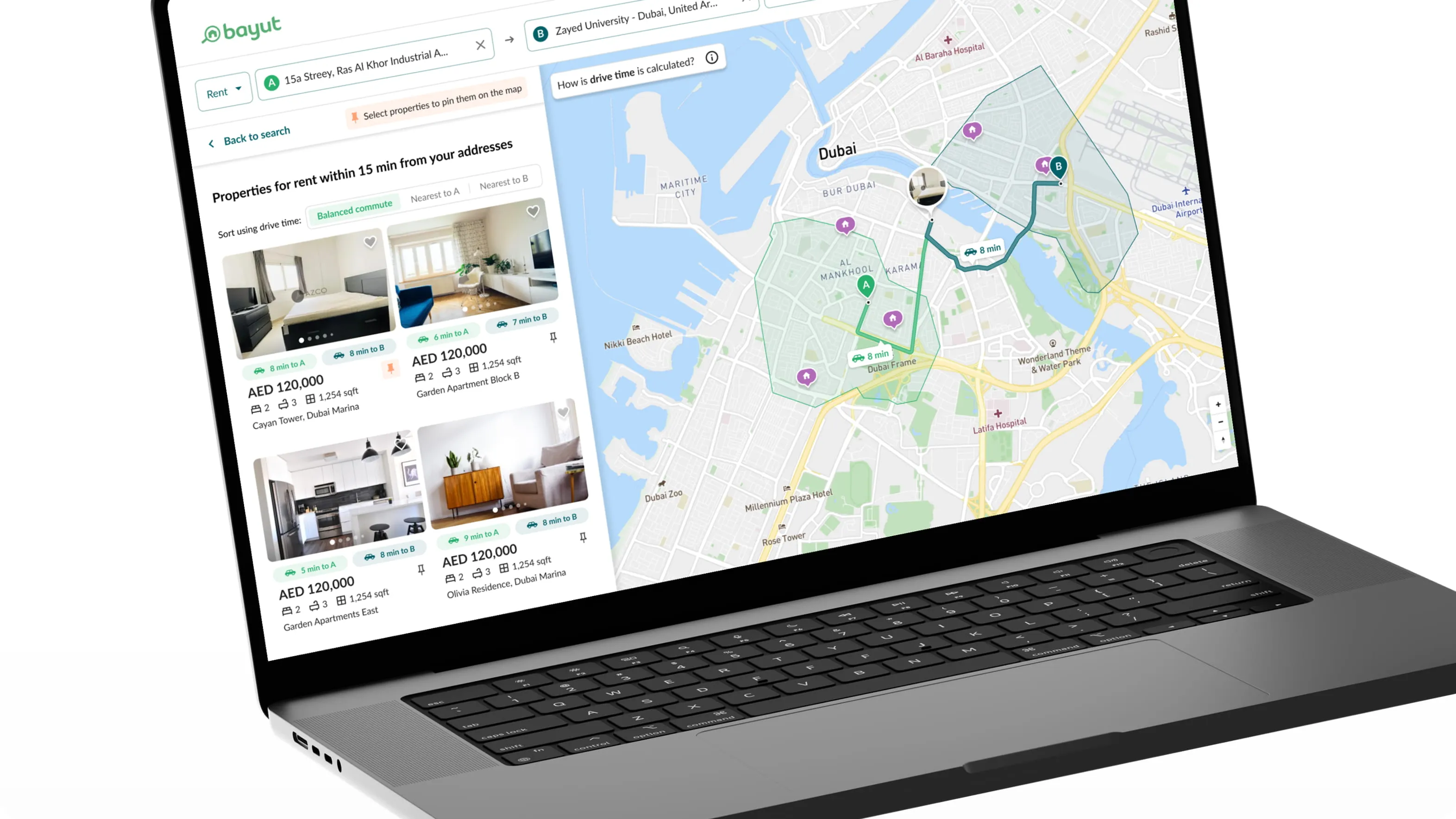
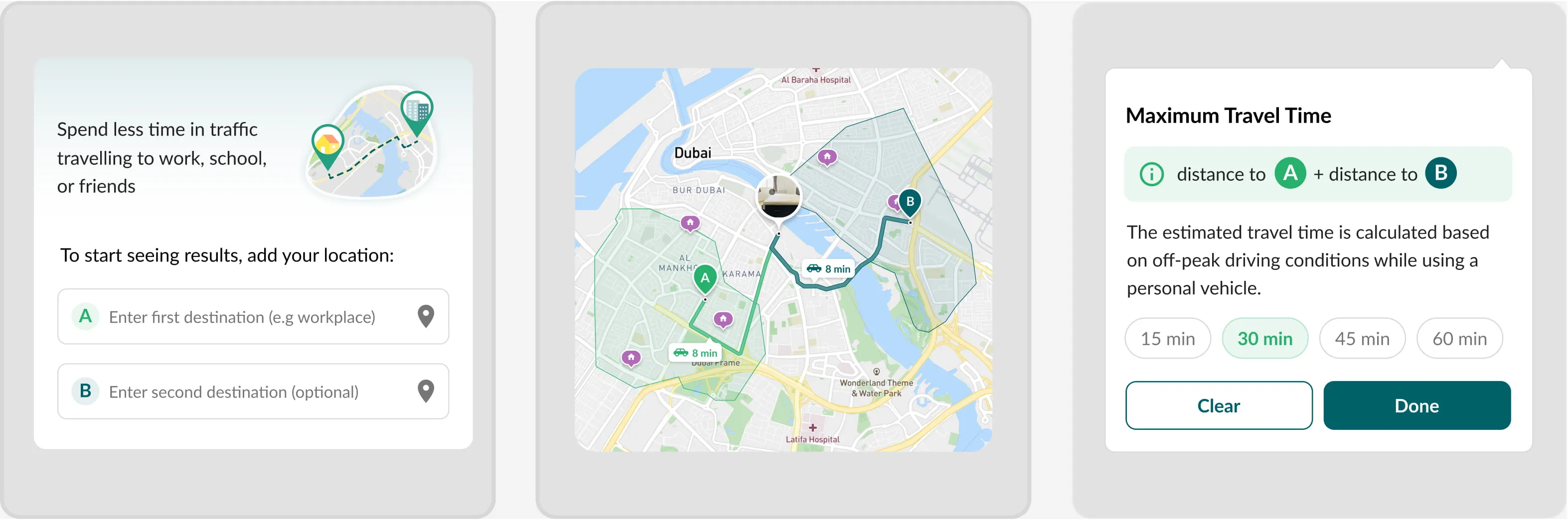
Property search has always started with a neighbourhood, but neighbourhoods don't map to daily life. This feature inverts that: users pin up to two anchor destinations, pick a maximum drive time, and Bayut redraws the map as a pair of reachability zones. Listings inside the overlap surface in the results, sortable by nearest to A, nearest to B, or balanced commute.
Shared shortlists
Batch share, track, and decide in one place
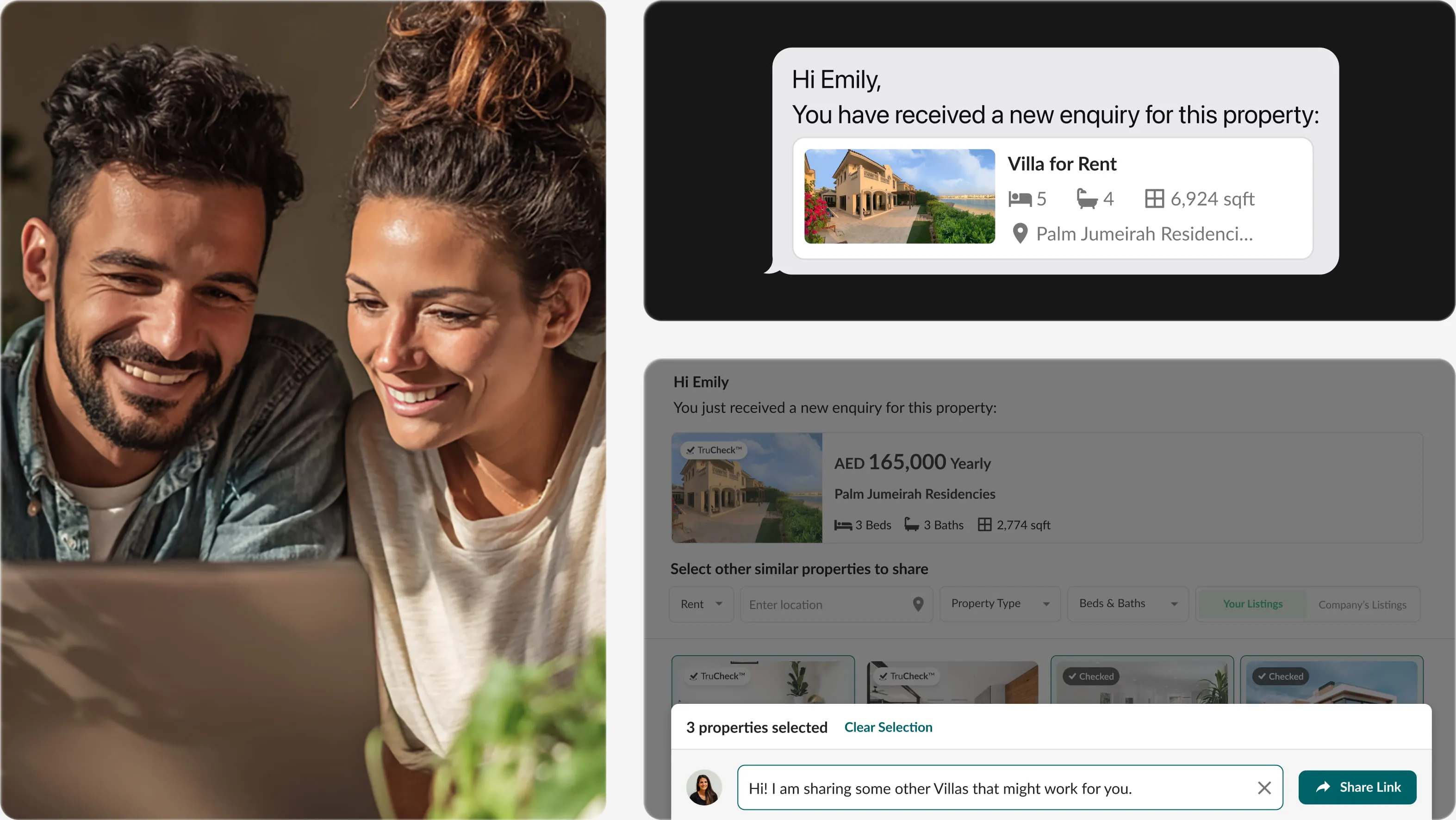
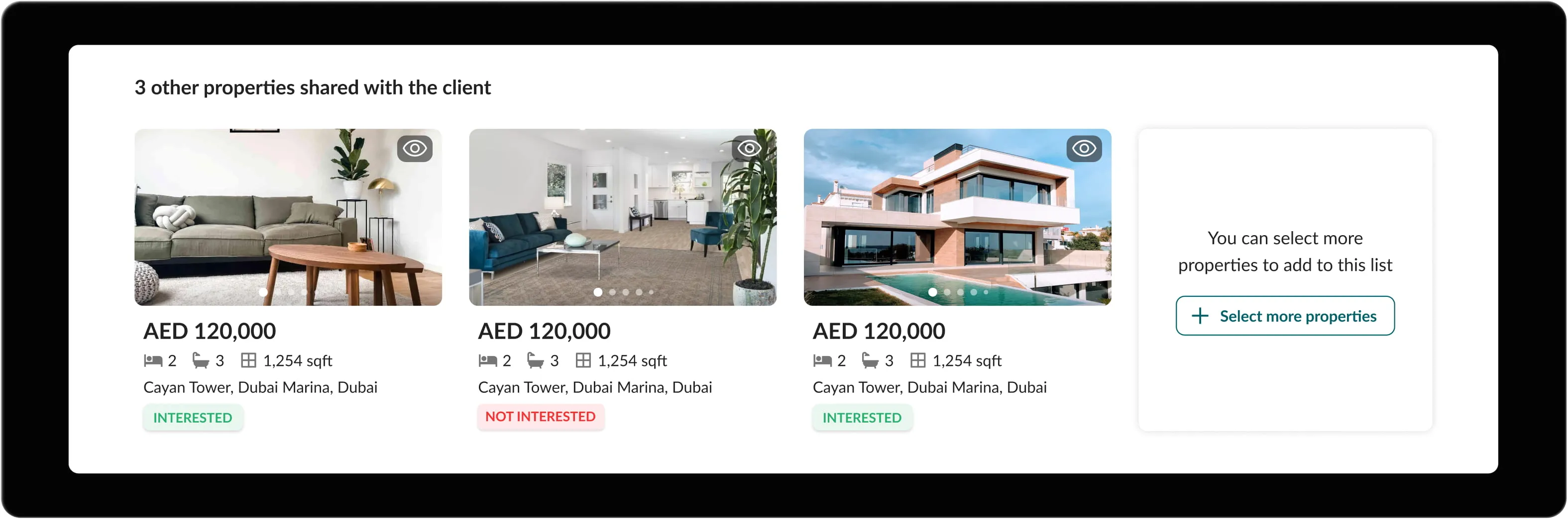
Property shortlisting used to spill across WhatsApp, SMS, and screenshots, and agents lost track of who had seen what. Now each enquiry has a single shared list. Clients react to each property, agents see what's landed and what's been ruled out, and the back-and-forth turns into a clear feedback loop.
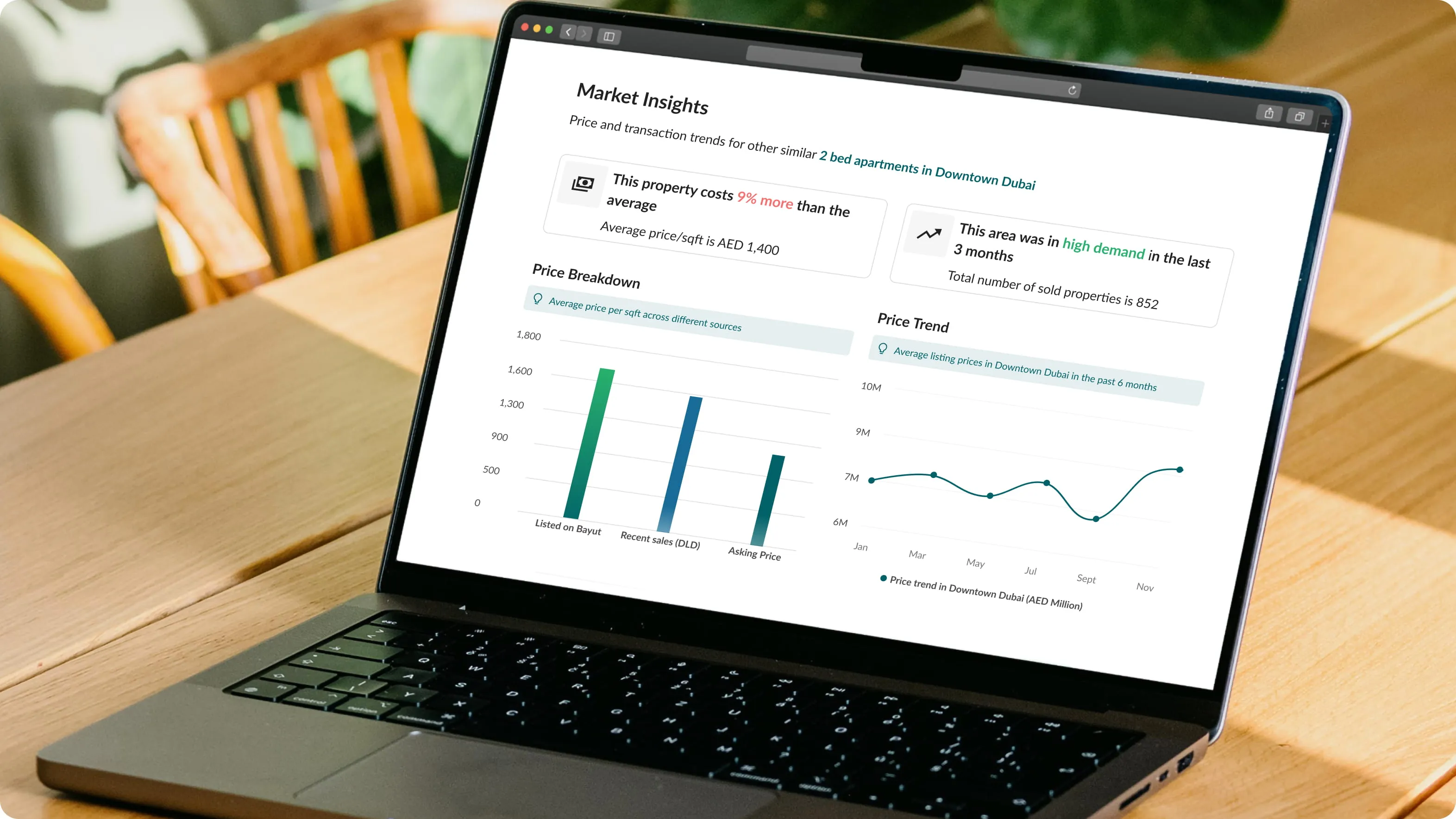
Transaction data
Verified market data at a glance
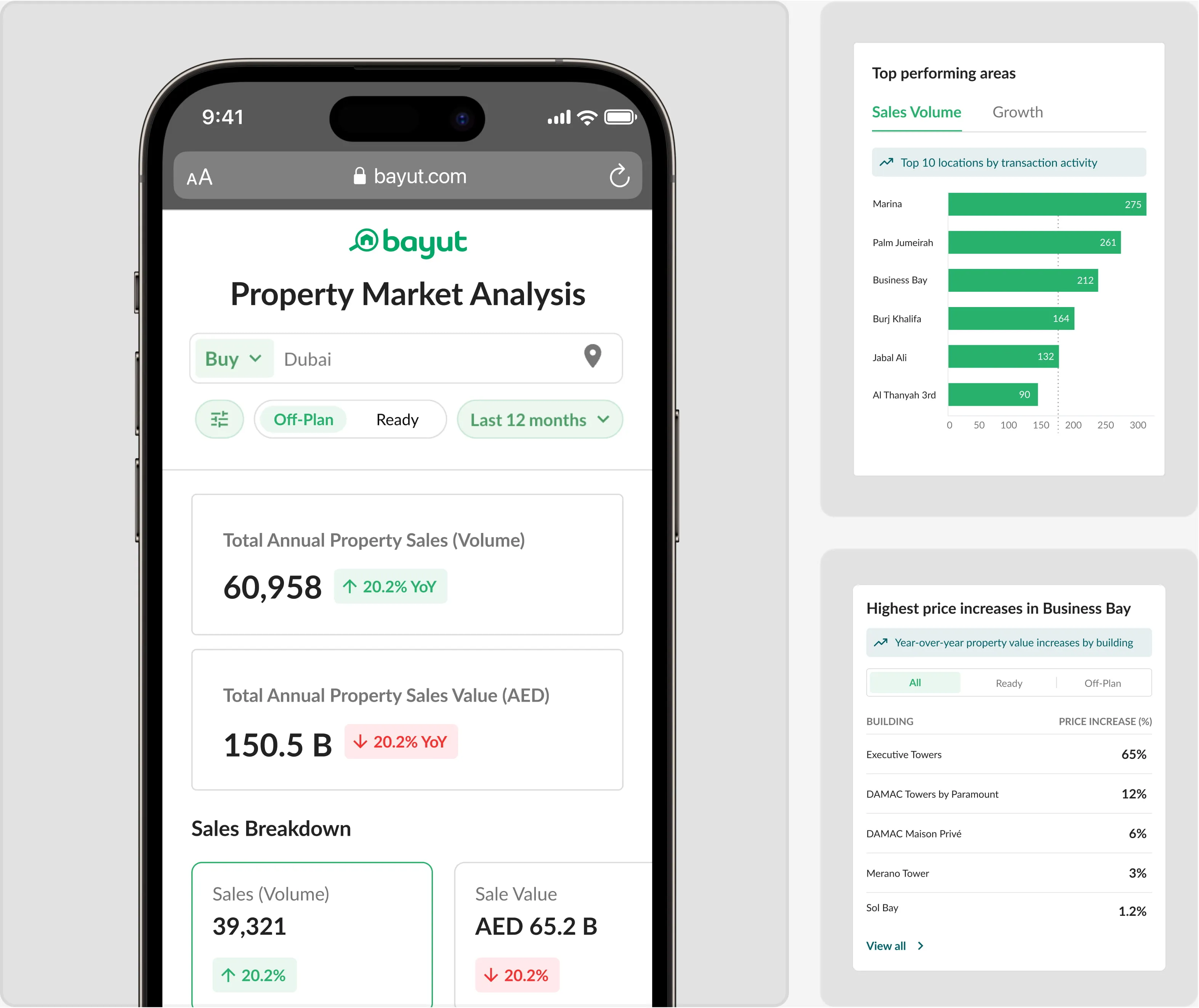
A live view onto every real transaction in the city, verified and refreshed daily, segmented by community and price tier, so investors stop guessing.
Validation through user research
Before scaling the feature (working title "Search 2.0"), we ran two rounds of research to test the two biggest unknowns: would people discover it inside a familiar interface, and once inside, could they actually complete a commute-based search?
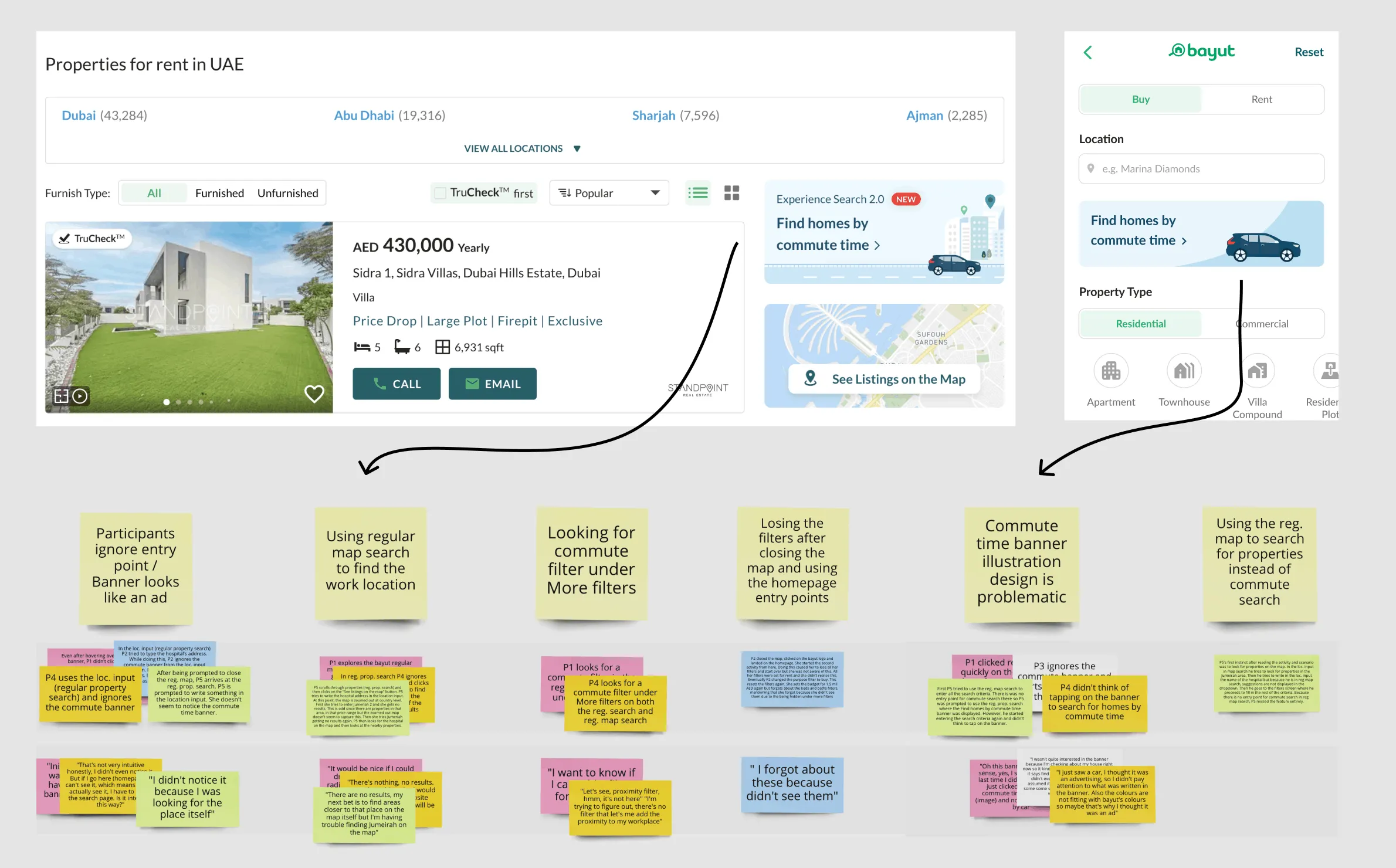
A/B test: entry-point discoverability
We tested three placements for the new feature against the existing search behaviour: a hero banner, a filter-bar tile, and a post-search prompt above the map results. The clearest signal was that participants treated banners as ads and routed straight to the regular map search. When they did want commute-based filtering, they hunted for it under "More filters", not at the homepage. The filter-bar tile won on intent capture, and the descriptive "Find homes by commute time" label outperformed the version-style "Search 2.0" wording, which is what eventually pushed the feature to its product name, Commute-based search.
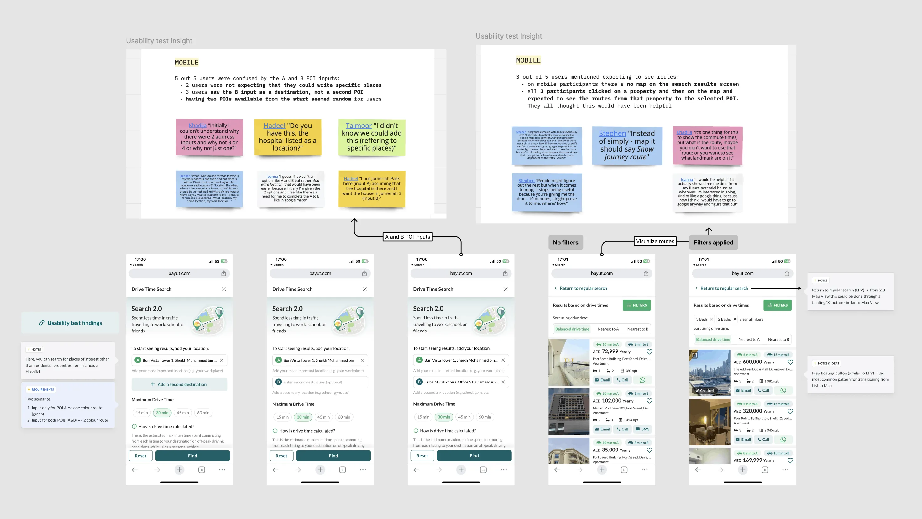
Usability test: completing the flow
Once inside the flow the miracle moments were clear: seeing the drive-time isochrone draw across the map, and switching from "no results" to "filtered results" instantly when relaxing the radius. Destination entry was where people struggled: 1 in 4 participants typed a neighbourhood name when the field expected a specific address, and lost confidence when autocomplete returned no match.
Reflections
Previously, finding and agreeing on a home played out across a patchwork of tools: searching on Bayut, checking commutes on a separate map, sharing listings over WhatsApp, and tracking replies in screenshots. The two features pulled those steps back into the product, with discovery, decision-making, and follow-up anchored to a single source of truth instead of scattered across tabs and chat apps. What mattered wasn't any single screen, it was that it all finally happened in one place.
The harder part was habit, not capability. Commute-based search works once people are inside it, but its entry point lives in tension with years of muscle memory around map-and-filter search. People went to the search they already knew, a reminder that a feature only counts once people can find it. People don't switch to something just because it's better. They switch when it fits their workflow.