Reframing in-flight connectivity as an experience passengers actually choose to stay in
- Industry
- Aviation / B2C
- Timeframe
- 2026
- Role
- Lead UX & Product Design
- Skills
- Discovery & synthesisProduct strategyInformation architecturePrototypingUsability testing
With no seat-back screens on most short-haul flights, the phone is the in-flight screen, and the design challenge was deciding what belongs on it: one white-label product that any airline can brand as its own, covering flight information, content, and commerce in one place.
Context
As Lead UX & Product Designer, I owned the work end to end, from stakeholder discovery and research synthesis through information architecture and design to a moderated usability study with passengers.
The project was shaped by where the market is heading. As connectivity becomes a commodity, the value shifts to what passengers actually do once they're online. A connected in-flight experience is usually reserved for premium carriers, so for a low-cost airline it becomes a real way to stand out. The challenge was deciding what genuinely earns a place on screen, so it holds up for passengers and as a product an airline would want to offer.
Impact at a glance
17
prior research studies, unified into one view that shaped the strategy
+22%
projected retention uplift from the gamified rewards feature
2×
projected engagement from personalisation, matching demand
Audience
The product had to serve two audiences at once, so I worked from three personas: two passengers with very different needs, and the airline buyer who actually purchases the product.
-
Frequent passenger
Flies twice a week and treats the cabin as borrowed time to use well. Fluent with airline apps but worn down by how differently each carrier behaves. Success is arriving on top of things: staying productive and informed the moment anything changes.
-
Occasional passenger
Flies about once a year, with a low-level anxiety and no real flying routine. Assumes the Wi-Fi probably won't work and isn't sure what the flight even offers. Success is calm and control: one trustworthy source of truth, and reassurance in the air.
-
Airline experience manager
The person who actually buys the portal. Measured on passenger satisfaction, engagement, and new additional revenue, they want a credible way to stay competitive without a risky capital project or extra load on cabin crew.
Key pain points to solve
- Passengers
- Airline
Getting online is uncertain
Many passengers, especially infrequent ones, assume the Wi-Fi won't work and don't know what the flight even offers in the first place.
Hours that feel wasted
The empty hours add up, and staying productive or entertained takes planning ahead: downloading shows or queuing up work before boarding. Anyone who didn't prepare is left with little to do, and the time just feels wasted.
Every airline is different
Inconsistency across carriers means passengers relearn the experience on each flight and fall back on a patchwork of their own apps.
Anxiety and lack of control
Occasional flyers want reassurance and a single trustworthy source of truth, not a scavenger hunt across gate, weather, and transfer details.
Revenue stops at the ticket
Carriers struggle to earn beyond the seat, and connectivity alone doesn't make a passenger choose them.
Bespoke builds are slow and costly
In-flight systems are expensive to run, and changes can take weeks or months to ship.
The challenge
How do you give any low-cost carrier a premium-feeling in-flight experience that passengers genuinely want to use, and that any airline can make its own without a bespoke build each time?
Two audiences, one screen
The airline decides if it gets on board, but the passenger is the one who uses it. Every decision had to hold up for both at once.
White-label by design
One product, many airlines. The same architecture had to retheme cleanly for very different brands without bespoke engineering each time.
Earn without selling
The business case rests on engagement, but anything that reads as a hard sell pushes people straight off the portal and undoes the point.
Framing the strategy
The hardest part of the brief wasn't visual, it was deciding what earns a place on screen. Before any screens, I anchored the work in what passengers actually need, then worked with the strategy lead on a shared lens for judging every feature against it.
User need
As a passenger, I want to stay on top of my flight and have something worthwhile to do, so that the time on board feels calm and well spent.
A shared lens for every feature
| Criterion | What it asks |
|---|---|
| Passenger value | Would a passenger need this, or reach for another app to get it? |
| Engagement value | Is it genuinely worth a passenger's time? |
| Ease of use | Is it obvious how to use? |
| Revenue potential | Can it support the business model? |
| Airline benefit | Does it serve the carrier's goals? |
Underneath the lens sat a simple commercial truth: dwell time is the primary revenue model. The longer a passenger chooses to stay inside the portal, the more room there is for content, perks, and partner offers to earn for the airline. That makes engagement and revenue the same goal rather than competing ones, and it is why the whole experience is built to be worth staying in.
Deciding what earns a place
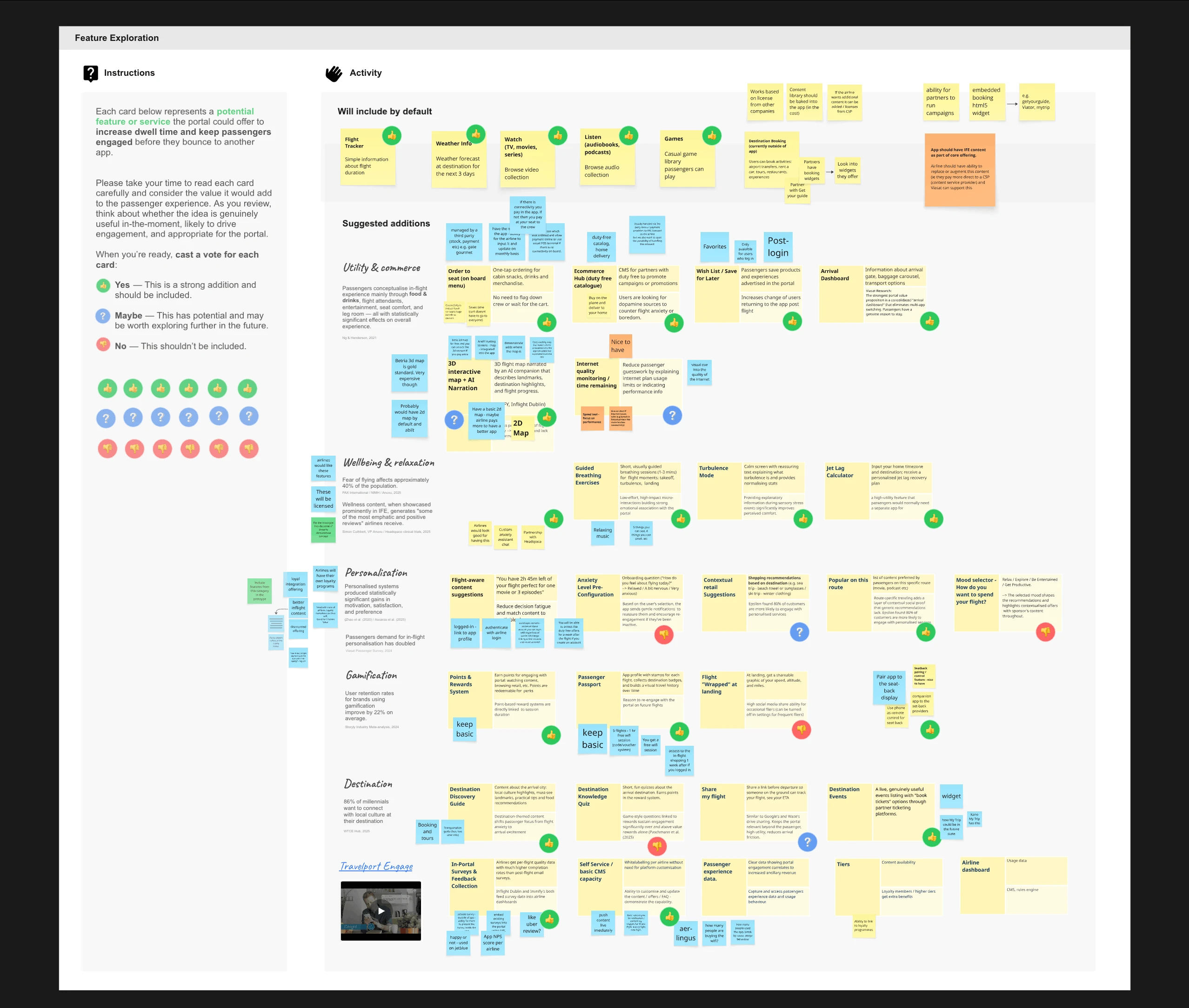
With the lens agreed, I ran a feature-exploration workshop. Every candidate, from order-to-seat and duty free to a flight passport, a jet-lag calculator, and wellbeing content, got a simple yes, maybe, or no against one question: would it genuinely drive in-the-moment engagement? Each card was weighed against the supporting research rather than taste, and the output was a prioritised feature set and, just as usefully, a clear list of what not to build.
~40%
of people are affected by fear of flying, making wellbeing a real need, not a nicety.
60%+
of travellers want real-time flight and journey updates, behind the live flight layer.
86%
of younger travellers want to connect with local culture on arrival, supporting destination content.
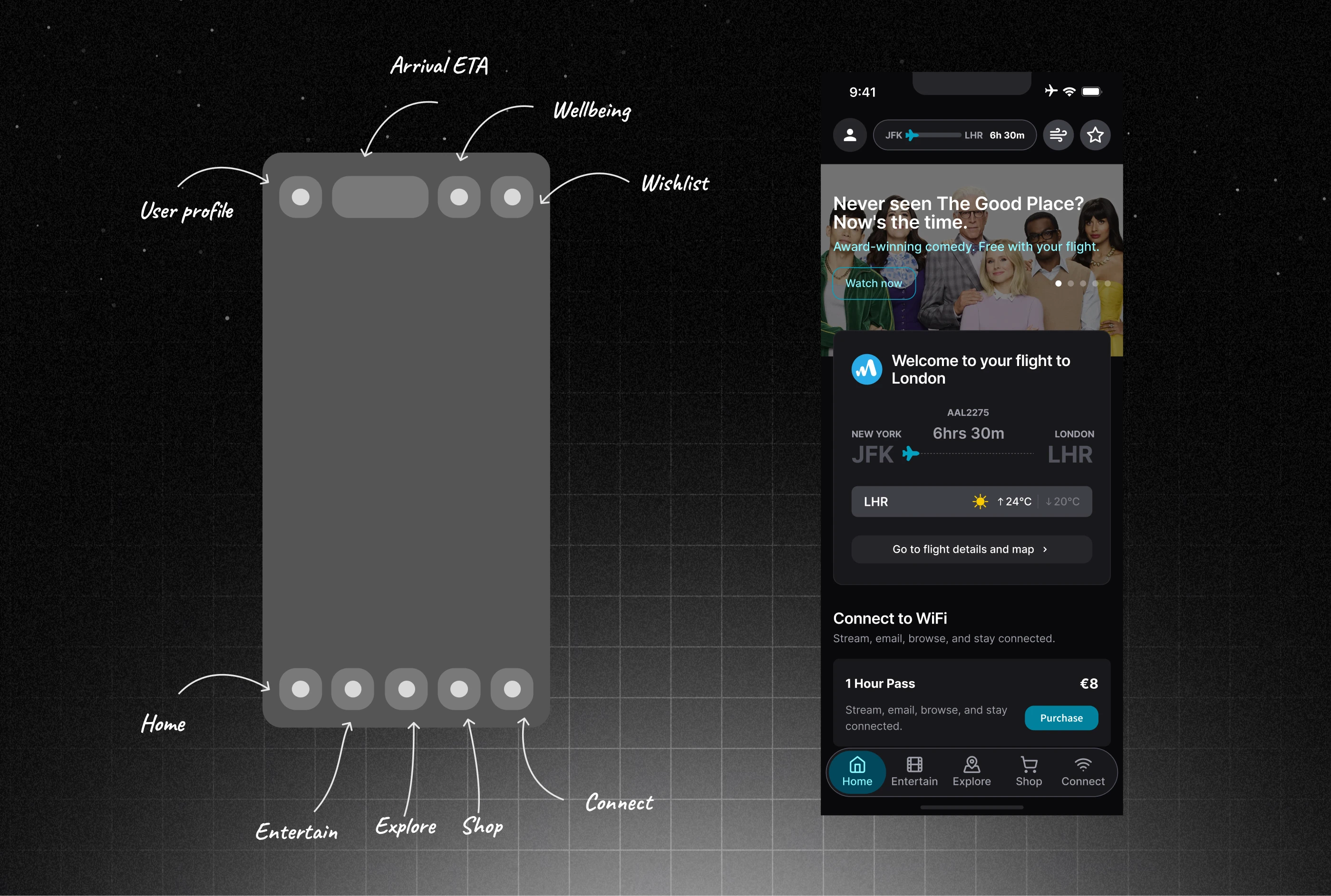
Information architecture
The product is organised around five clear tabs, Home, Entertain, Explore, Shop, and Connect, with the essentials always within reach in the top bar: profile, live flight status, wellbeing, and saved items. A small, learnable structure that holds steady whatever the airline.
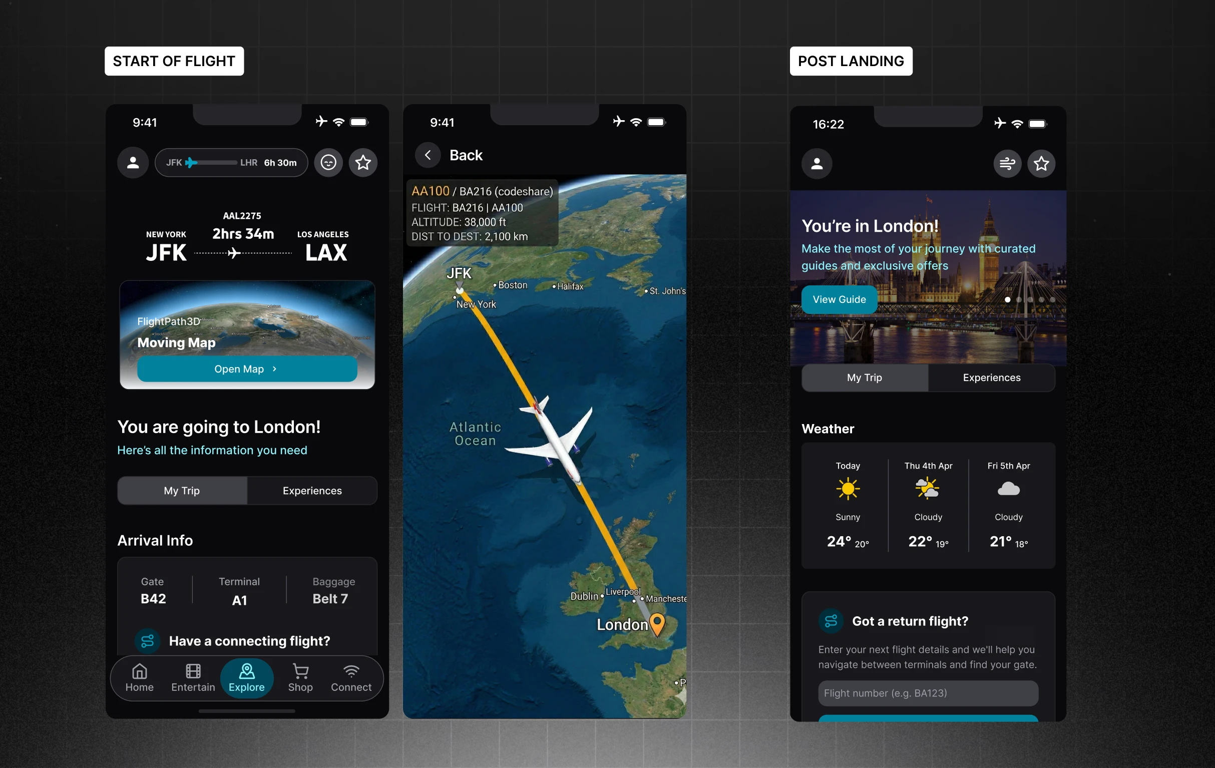
Dynamic through the flight
The content is dynamic, shifting with the moment in the flight. What surfaces at boarding is not what surfaces at cruise or on descent: settling-in gives way to things to do mid-flight, then to arrival and what happens after landing. This context-awareness is the core of the product, surfacing the right thing at the right point in the journey.
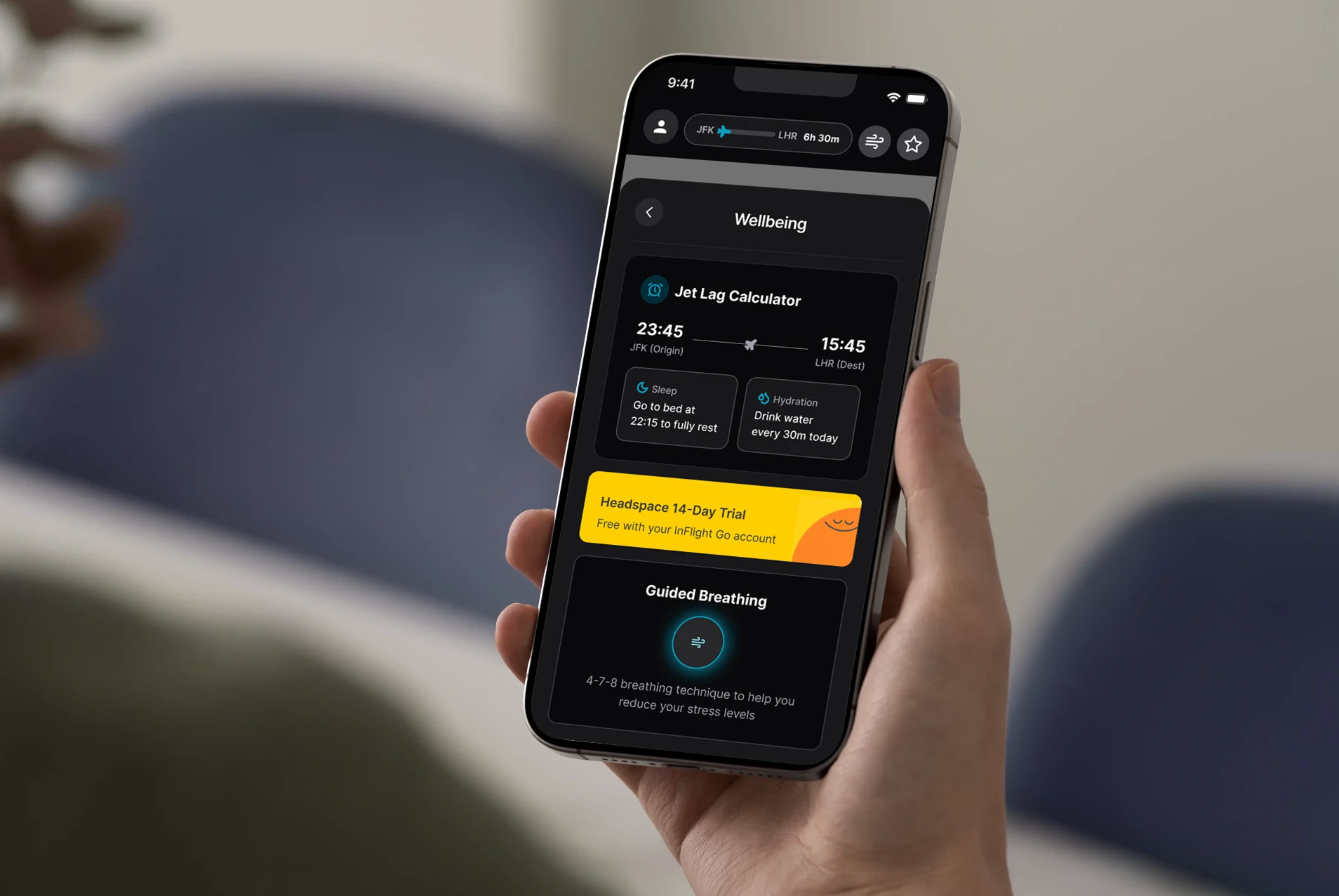
Easing flight anxiety
Fear of flying touches around 40% of people, so calming tools sit a tap away: guided breathing, distraction, and reassurance, with a jet-lag calculator to help passengers arrive feeling human. Quiet support for the people who need it most.
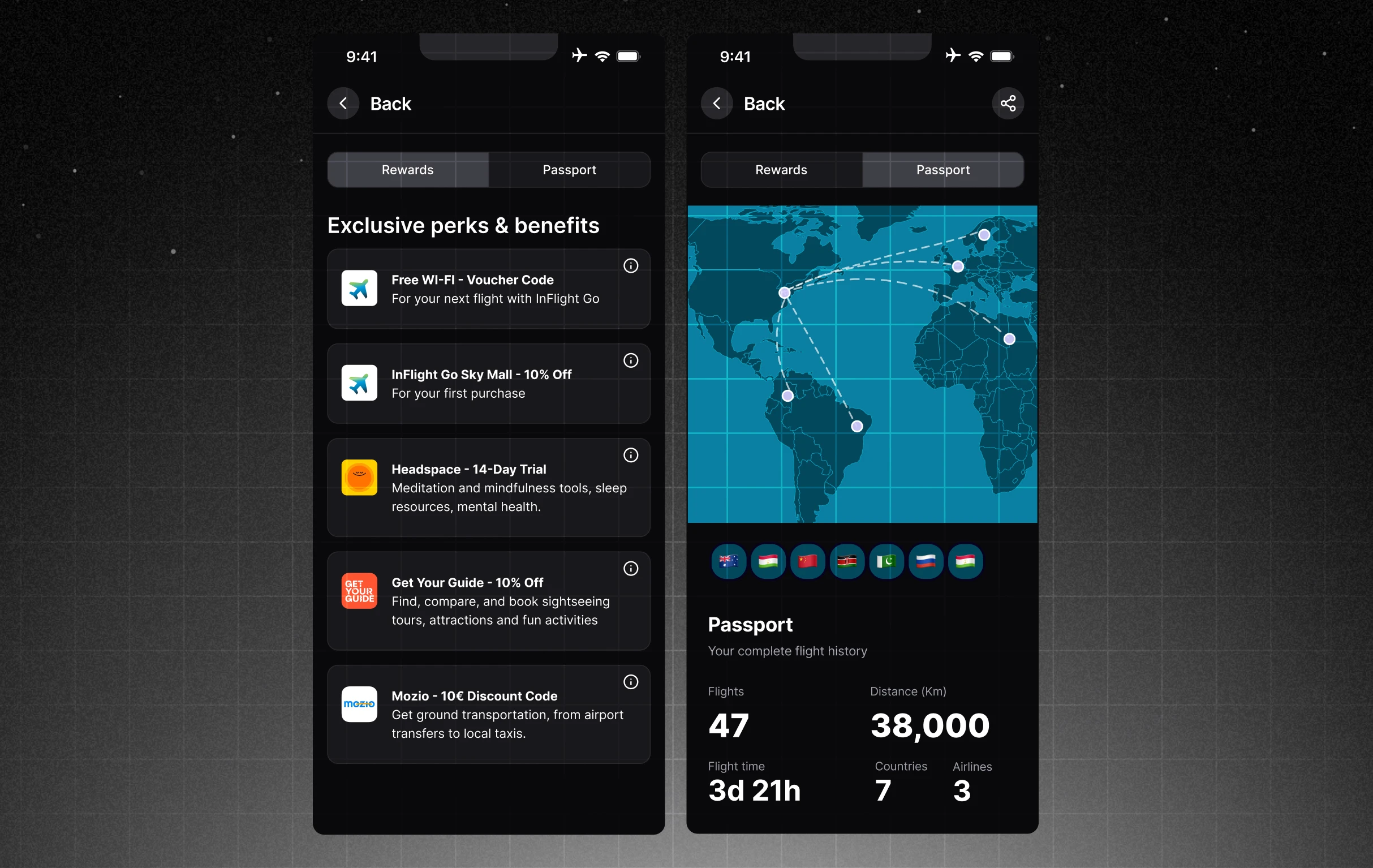
Gamification as a retention pattern
Two mechanics give passengers a reason to come back. A light rewards layer, led by free perks, keeps engagement playful rather than transactional. And Passport turns travel into something collectible: a personal record of routes flown, hours in the air, and countries reached, which testing showed was the single biggest reason people created an account.
The same app, any airline's brand
A glimpse of the same product wearing four different airline brands. One white-label build retints to each carrier: brand colour, tone, and logo flex around a shared, cabin-friendly base, so a new airline just means applying a new theme: the underlying experience stays consistent across carriers, without the complexities of having to start from the ground up.
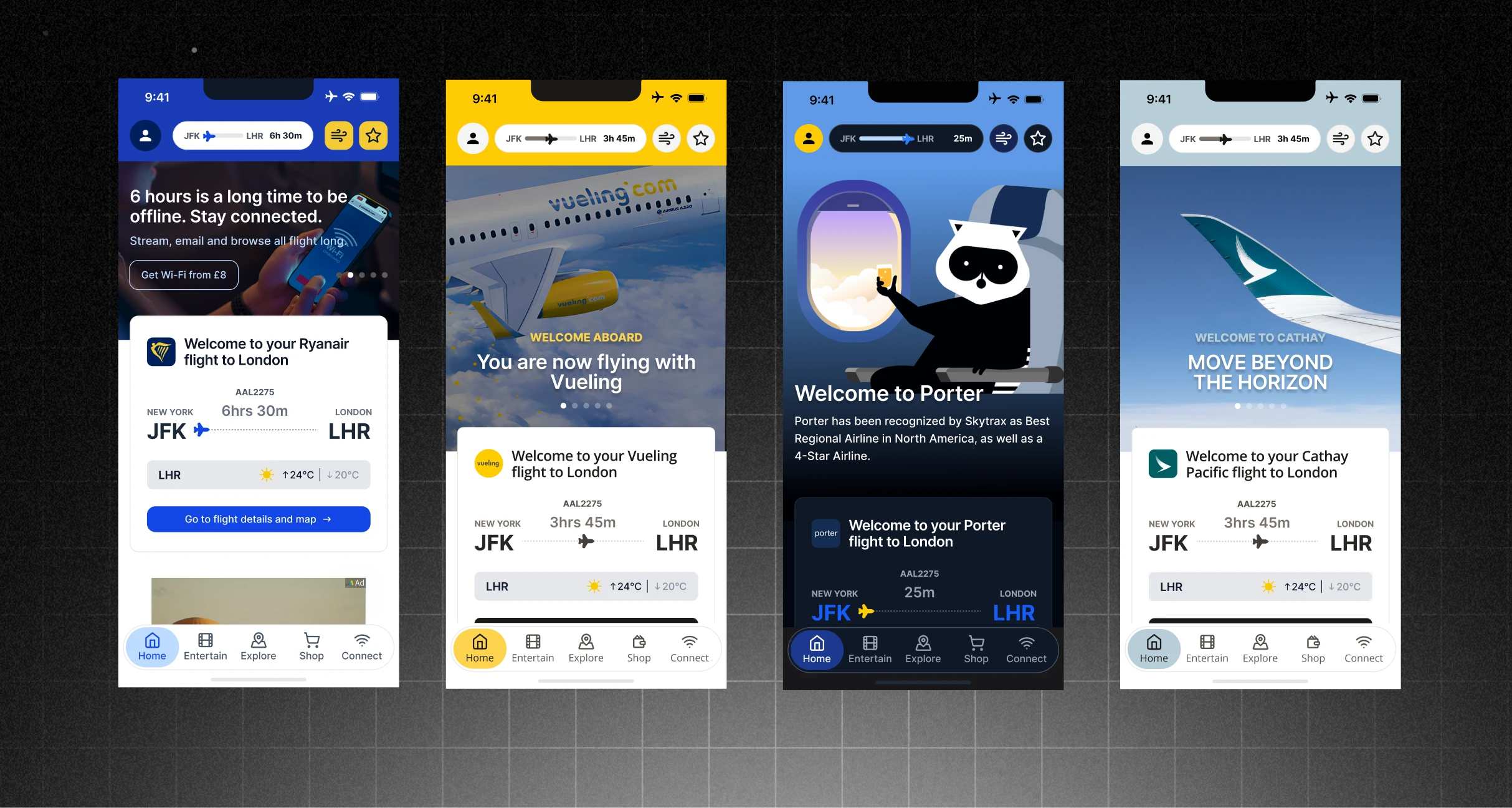
This flexibility came straight from the design system, where I built the patterns and components as themeable building blocks: brand colour, type, and logo pulled out into variables rather than fixed into each screen. Components also carried variations and layout alternatives, so the system could flex to what each carrier needed.
Validation: usability testing
I ran a moderated study with five recent flyers on a clickable prototype, pairing a semi-structured interview with concept evaluation. With five participants the results are directional, focused on comprehension, desirability, and intent rather than task completion.
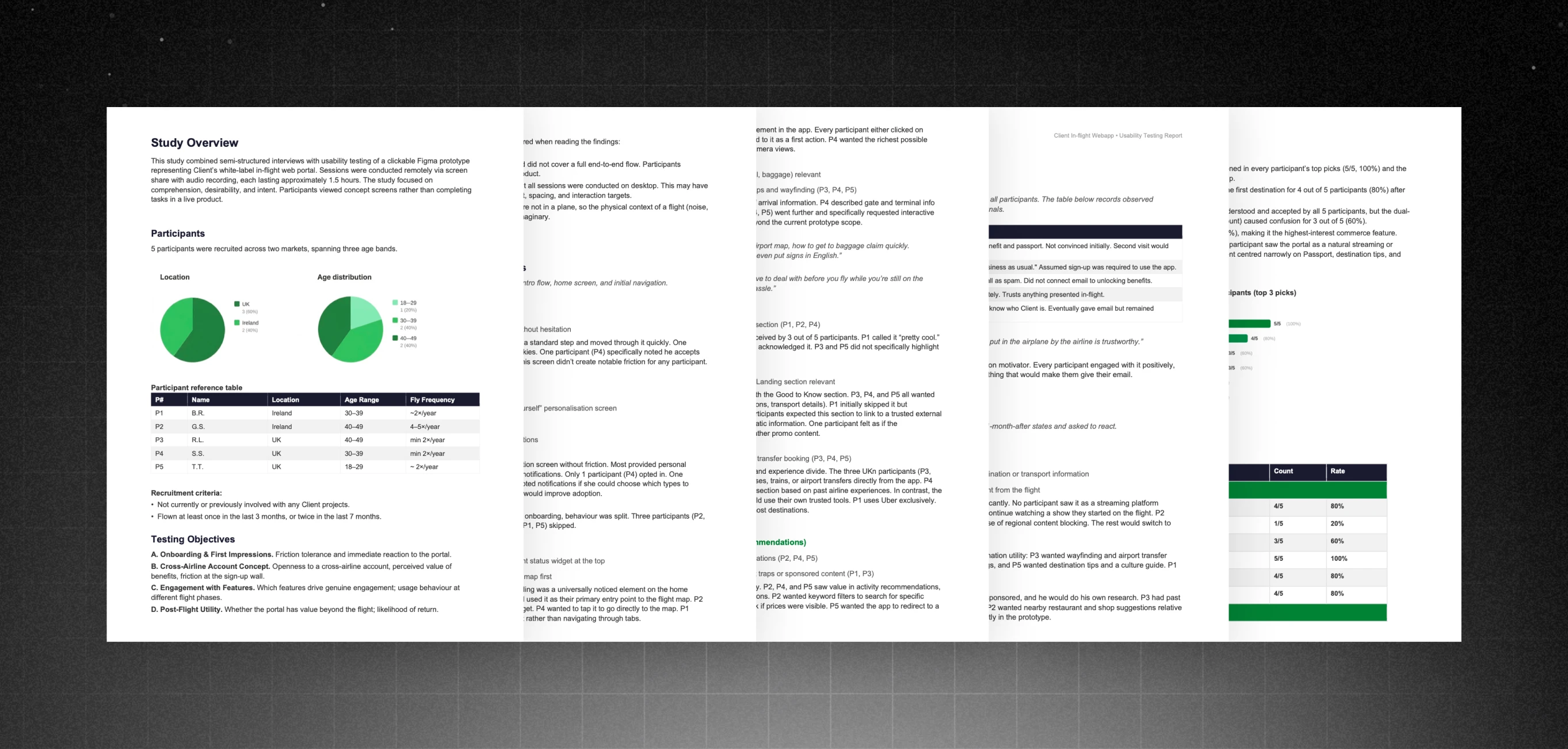
What held up
- A live flight-status widget counting down to landing was the most-noticed thing on the home screen.
- Practical arrival details (gate, terminal, baggage) and a live map of the flight drew everyone in.
- Passport, a personal log of past and upcoming flights, was the top reason people would sign up.
- Ordering food and drinks to your seat was the commerce feature people wanted most.
What needed work
- Splitting sign-in into two accounts (the airline's own and a cross-airline one) confused most people, so the fix is to merge them into a single login.
- The icons in the top bar were easy to miss.
- The rewards section felt like a sales pitch, so it was reframed to lead with free perks.
- A few feature names were unclear and needed plainer wording.
Pushing back
Stakeholders pushed for a universal account layered on top of each airline's login. I argued against it: the dual-account setup did not match how passengers think, and testing confirmed the confusion. The same went for grouping every universal-account perk into one screen, which tested as cluttered rather than convenient. Holding that line meant telling stakeholders no and letting the research settle the argument.
Reflections
This was as much a strategy and research project as a design one, and the lessons that stuck were less about screens than about judgement: who to design for, what to trust in the research, and when to let an idea go.
Designing for two audiences was the discipline
Because the passenger uses the product but the airline buys it, every choice that delighted a passenger still had to earn its place commercially. Holding both in view kept the work honest.
Concept acceptance is not comprehension
Every participant accepted the cross-airline idea, yet most tripped over the two-account mechanic beneath it. People can welcome a concept and still misread how it works.
Let the evidence retire ideas
An AI companion for in-flight anxiety tested poorly with everyone who tried it, so it came out. Cutting on a clear signal matters as much as knowing when a sample is too small to conclude.